I noted in my introduction to global warming Profits of Doom, that:
The IPCC’s warming figure of 0.8 degrees Celsius over the last century is doubtful, for at least two reasons.
First, no one knows for certain how much of that increase is due to what is called the Urban Heat Island effect. Industry, air-conditioners, vehicle traffic and other human activity, along with large amounts of concrete and asphalt, can increase the night-time temperature in city areas by as much as three degrees compared with that of surrounding countryside. Many temperature recording stations which were in rural areas at the time they were established are now well within city limits.
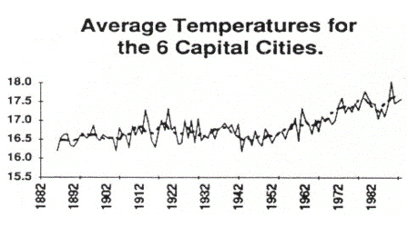
The difference this makes can be seen clearly in these two graphs which compare average temperatures in the six Australian capital cities from 1882 to 1992, with records from twenty-five regional and remote Australian recording stations. The graph of city temperatures shows an increase of about 0.8 degrees, which the IPCC claims is the average global increase over this period:

Australian Capital City Temperature Change
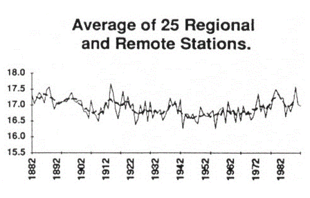
This second graph, of rural and remote stations, shows minor fluctuations, but no overall increase at all:

Australian Rural Temperature Change
Now Michael Hammer has posted an article on Jennifer Marohasy’s blog which looks in much more detail at the urban heat effect in one major Australian city, Melbourne, compared with surrounding rural areas including regional centres.
He concludes:
The data for Ballarat, Alexandra and Mildura suggest no temperature rise at all over the measurement period and especially (Ballarat and Mildura) over the last 3 decades. Horsham data suggests some temperature rise early in the century but if anything cooling over the last 3 decades. Cape Otway is questionable, there is an 0.7C rise in minimums but a 2.1C fall in the maximums most of which occurred in the early part of the century before the rapid rise in carbon dioxide. The last 3 decades have seen a return to the temperatures of the 1920’s.
Overall one would have to say the Bureau data suggests no significant warming over the last century and in particular the last 3 decades in Victoria. On the other hand it does show significant UHI. Consider that an increase of 1.5C in the minimums for Melbourne over the last 3 decades corresponds to 5C per century. Averaging the minimum and maximum readings yields a rise from 14.7C to 15.7C over 30 years equating to 3.3C per century and Melbourne is far from the worst city in the world for UHI.
The data analysed here is real, high quality, data from Australia’s premier weather/climate organisation. It is completely at odds with the claims of about 0.6C of warming over the 20th century predominantly in the last 3- 4 decades. Is Victoria really so anomalous or are the AGW claims questionable?


Leave a Reply